Sansitation Job
Someone might have done Harriet the favor of not putting this particular quote in what appears to be Comic Sans. If you need help understanding why, see here.
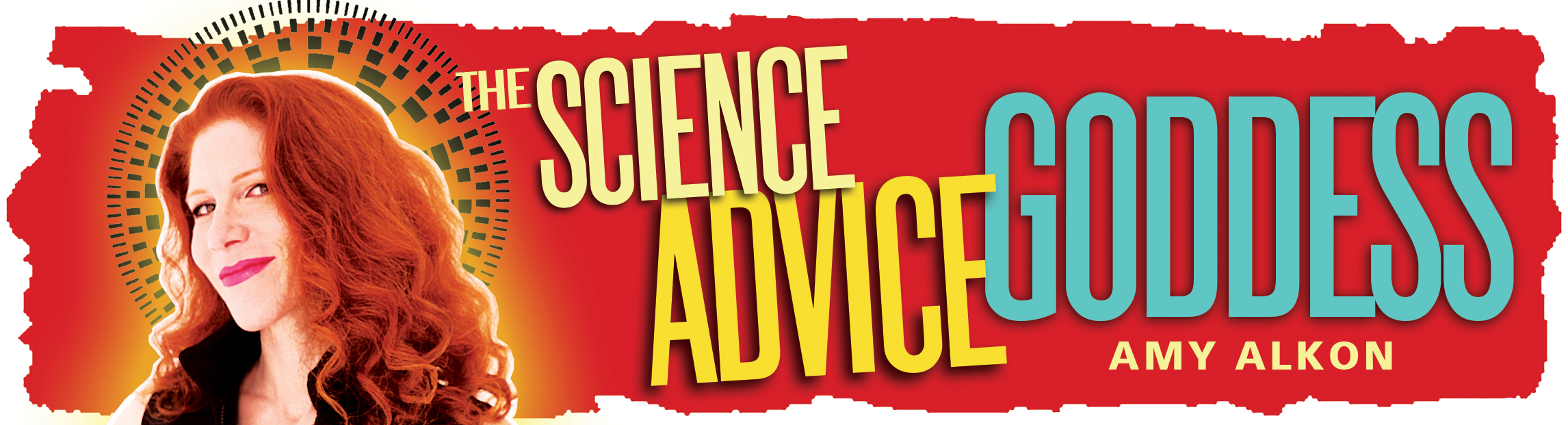
AMY ALKON, APPLIED BEHAVIORAL SCIENCE AUTHOR, SPEAKER, NATIONALLY SYNDICATED COLUMNIST
B L O G
(MOSTLY STUFF BEYOND SCIENCE)

Amy Alkon
SEARCH BLOG
'We are a participant in the Amazon Services LLC Associates Program, an affiliate advertising program designed to provide a means for us to earn fees by linking to Amazon.com and affiliated sites. As an Amazon Associate I earn from qualifying purchases."

Amy on Twitter
MAIN MENU
Columns
Blog
Features
Rude People
Amy's Books
Bio/Contact
Advice Goddess Radio
Private Sessions
Masthead by
Little Shiva
Goddess' Dog (Aida)

Lucy (1998-2013)


4.37


They should have used wingdings.
Conan the Grammarian at April 24, 2016 3:31 PM
Nothing wrong with that font. The CERN used it to announce to confirm the existence Higgs Boson.
Sixclaws at April 24, 2016 3:34 PM
wouldn't have used that font for this quote from this woman in a million years. I'm not one to make assumptions but I'd lay down good money the offender was not female.
gooseegg at April 24, 2016 4:14 PM
Comic Sans is an easily readable, but casual font. It conveys an impression of handwriting. For something like this, it works. For formal or serious presentations, it looks a little too junior high glee club.
I stay away from it for business presentations, preferring Arial or Verdana; sans serif fonts are easier to read from a distance or on a computer screen.
Times New Roman works better for printed or print-like material - books, newspapers, written memos, paperwhite Kindle screens, etc.
Are fonts really that important? Outwardly, no. They do, however, convey a subtextual impression.
So, like the door-to-door salesman, if you want someone to open door for you, you dress like someone who can be trusted. If you want someone to take your professional presentation seriously, you don't use casual fonts.
Conan the Grammarian at April 24, 2016 4:47 PM
I have to admit I just use the default font, which ever one that is. And if it looks too stupid I do Times New Roman. I just don't have the energy for a font debate.
Ben at April 24, 2016 5:00 PM
I've actually had two bosses who seemed to care more about the font in a presentation than the information in it.
And one was the CFO of the company. The other was a former graphic artist promoted to managing a market research team.
So, I've learned to defend my font choices.
Conan the Grammarian at April 24, 2016 5:42 PM
It's easy to read. Get over it.
And I'm well aware of what it was created for. (I'm a former comic book aficionado.) That doesn't matter. It's pleasing to the eye, and it's expanded in use. It's not a faux pas to use it.
So, can we get off the "How dare you be unserious!" soapbox already? Being concerned over this is petty and frivolous.
Patrick at April 24, 2016 5:50 PM
Patrick, by your comment you've obviously never worked in a large company, where the "petty and frivolous" can achieve outsized importance and become the linchpin on which entire careers can hang.
Most companies of any size have standard Powerpoint templates, complete with logos, designs, fonts, and colors. Any deviation from them, including non-standard font choices, can bring down all sorts of condign opprobrium.
I'm surprised you didn't encounter it in the Army, where, according to my serving friends, preparing and presenting Powerpoint decks has become a major part of non-combat duties.
In my own experience, I've had to spend hours updating the data in Powerpoint decks that started life before I did - wherein the legacy versions of the software could not handle the presentation of data as envisaged by the original creator and my choices were to take on extra work by updating the slides with the capabilities of the updated software or use the outdated (and often clunky) legacy methodology (lots of manually placed text boxes and overlapping graphics) to achieve the same effect.
"Meatball Powerpoint" one of my coworkers dubbed it - after the "meatball surgery" in M*A*S*H, designed to stabilize, but not actually cure, the patient. Get the slide in and get it out quickly and move on to the next one in what is usually a very large deck.
Conan the Grammarian at April 24, 2016 6:11 PM
Oh, brother. Conan's spoiling for another fight, so he can moan about how horrible I am for raining derision on people who disagree with me. Oh, boo-hoo-hoo, and all that.
Yes, Conan, I'm absolutely awful. I'm terrible. I am the worst person I knwow. If it makes you feel any better, I've left instructions in my will so that when I die, I'm to be buried face down so I can see where I'm going!
And you, obviously, have the patience of a saint to engage me, despite my sheer unparalleled horribleness.
I didn't read the post, Conan. Sorry. I read the first line, saw it was directed to me, went to the bottom, saw it was you, realized what you were up to, and decided, "Not tonight." Tired, not feeling well. Stuck at home due to something that my doctor told me has the rather prosaic name of "muscle strain." You'd think something so debilitating that I can hardly walk would be called something more interesting.
Anyhow, the doctor says I need to give up weight-lifting for 1-2 months. (Which sucks.) That I should apply lots of ice and take Meloxicam. (Not fun, but will do.) Take up swimming in the meantime. (Not my favorite activity, but will do. It's better than nothing. Water is not the natural habitat of human beings.) And that I shouldn't do squats at all, ever again. (Fuck that!)
My only point is, this is such a non-issue. I saw nothing inappropriate about using comic sans. In fact, since comic sans is so named because it resembles the handprinted lettering of comic book letters, those individuals who meticulously print the words in comic books. (My personal favorite is Tom Orzechowski.)
Somebody obviously tried to make a fitting tribute for Harriet Tubman and probably took to the time to research and attach a fitting tribute to her, and you're complaining because he wrote it in comic sans?
If it bothers that much, you can always make your own, Amy. Making memes is not hard. They even have websites for it.
It just seems so petty to complain about it. Does it really bother you that much? I wouldn't have even noticed the font. I would have looked at it and said, "Hey, someone made a nice meme about Harriet Tubman. A fitting tribute to a very courageous woman and appropriate now that she's going to grace the twenty dollar bill. Very cool."
It rather reminds of the complaints you had about Brad Pitt building houses in New Orleans at his own expense for people who'd lost everything they owned. "But they're uuuuuuuuglyyyyyyy!"
Brad Pitt spends his own money to give free homes. To people who'd lost everything they ever had. Houses, cars, valuables, loved ones, pets, memorabilia, lifelong keepsakes, items of sentimental value, everything.
Couldn't you have at least given equal space to commend Mr. Pitt for being so goddamned fucking generous that it makes me sick?
Would you have felt better if he tried to rebuild the slave shacks that used to be there?
Just being so preoccupied with the font. It's like buying someone a gift, that might have been absolutely perfect but for one trivial detail. And they don't even thank you. They just go on and on about the one trivial detail that they just didn't like.
I'll come back and read it tomorrow, Conan. Then I'll rain derision upon you like Armageddon and you can complain about it. Just can't do it tonight.
Patrick at April 24, 2016 6:53 PM
Give it a rest.
No one said or implied that you were awful.
The post was a mere observation that you're apparently not familiar with the importance that the "petty and frivolous" can acquire in large bureaucratic organizations.
Try reading something before you complain about it. Not everything conforms to your preconceptions.
And if you'd actually read my earlier post, you'd know that I see nothing wrong with it either. However, in professional presentations, it can come off as too casual for the audience or subject matter. And there are people who do have strong feelings about its use.
Rain all you want. I don't care enough anymore to respond to your rants and pretensions of intellectual superiority. And it's no longer in me to offer advice to you.
Hope you feel better.
Conan the Grammarian at April 24, 2016 7:19 PM
True. I never have worked for a large company. At least not in any capacity that would require me to use PowerPoint.
My point was that going to war over a simple meme, which someone likely created with the best of intentions, is petty and frivolous. I wasn't intending to imply that companies shouldn't care if an employee chooses not to use the Times New Roman in navy blue provided in the organization's PowerPoint template, and replace it with Kristen ITC in hot pink.
Under such circumstances, I would simply use the fonts provided by the template. It would be inappropriate to substitute my own choices.
When I was in the Army, PowerPoint was in its incipient stages and had not yet caught on. Windows had not yet replaced DOS.
Thank you. I do. Not in pain this morning, but my leg feels like it's not quite attached to my body somehow. Weird sensation. But at least it's not painful. More ice, I guess.
Patrick at April 25, 2016 12:46 AM
Patrick, this may surprise you, but I hope you heal quickly, also.
Of course, the font debates are fueled by competition and some degree of research about what affects perception. All but a half-dozen are useless to me, because I don't prepare presentations; I don't do regulatory documents any more. I wish I could disable/unload more from my system.
Helvetica/Arial was chosen by some government stooge out here at SRS because, get this, it reduced the page count of procedures (it's a PITA to edit because the kerning is narrow).
That's after 35 years of Pica on IBM Selectrics. We still think the PC is a typewriter...
End of story, since what we do out here is stupid and of little interest.
Radwaste at April 25, 2016 1:26 AM
> font debates are fueled by competition
> and some degree of research about
> what affects perception
If you're writing something interesting enough, no one will care about the font, including those very researchers, who no doubt feel life is cheating them somehow and need clear ideas to move onto something better. If you care more about the font than the text, you're spending too much time reading.
Crid at April 25, 2016 1:38 AM
Bah.
There's a reason paperbacks are all in approximately the same serifed font.
You're not chewing through 800 pages of Harry Potter in Comic Sans.
Radwaste at April 25, 2016 4:48 AM
Saying fonts don't matter is like saying looks and clothing don't matter if the person has other fine qualities. Font, spacing, and leading strongly influence how the reader feels about what he is reading. Very small changes can have significant psychological impact, and this is true even among fonts that, at a glance, look similarly austere. Anyone with the interest can find fascinating articles and studies on the subject.
But that debate is overkill here.
Comic Sans is the pink knockoff Ugg boots of the font world, in that many people think there's NEVER a good occasion, and I think this was a light-hearted post.
Insufficient Poison at April 25, 2016 6:08 AM
I was at an auto race this weekend, and one of the series that was racing requires that the numbers on all the cars be in a standardized form. Looking at some cars up close in the paddock, it dawned on me that the digits were in Comic Sans. From the typical distance between the cars on the track and the spectators, you can't tell; it just looks like a generic sans-serif font.
Cousin Dave at April 25, 2016 8:07 AM
It is harmless in most contexts, but to those who work with typefaces (publishers, editors, marketing people, graphic designers), as well as younger people who know that mocking Comic Sans is a meme unto itself, it screams "hilariously out of touch."
Memes can be made by anyone, and Comic Sans is one of the handful of free fonts offered by meme generators, so its use isn't surprising.
I think Amy is just pointing out the contrast between the wacky font and the seriousness of the quotation, and how that lessens its impact.
Insufficient Poison at April 25, 2016 8:18 AM
Careful, you're dangerously close to sounding like Artemis/Orion and his "it doesn't matter who I am or what I do, my argument should stand by itself" tantrum.
Fonts do have some importance. The University of Michigan conducted a test and found that students were reluctant to tackle reading assignments when less readable fonts were used in the text. it seemed like too much work to them. However, when easily readable fonts were used, both willingness to read the text and retention of the information presented increased.
Researchers have even found out that the fonts used can have an effect on the ability of dyslexics to read the text. Although, in an ironic twist for this thread, The British Dyslexia Society recommends Comic Sans as a font easily read by dyslexics.
Like Radwaste pointed out, whole books are not published in Comic Sans, but in easily readable fonts like Helvetica, Arial, Times New Roman, Garamond, etc.
Conan the Grammarian at April 25, 2016 10:40 AM
Sheezus, what the fuck?
> Font, spacing, and leading strongly
> influence how the reader feels about
> what he is reading.
There's a name for people who affirm the primacy of feeling in world affairs: They're called "girls." If and when they grow up, they can be a lot of fun.
>it screams "hilariously out of touch."
So it's important to be 'in touch'? The fashion-ravaged idiocies of chickenshit, groupthinking children --sharing feigned bemusement in transparent, desperate social postures-- are a big part of our problem... And you'll never guess who said so last week.
> "it doesn't matter who I am
> or what I do, my argument
> should stand by itself"
Paradox-- Those vapid, blind-man-in-a-museum arguments are his/her essential identity. Changing names didn't fool anyone here.
> The University of Michigan conducted
> a test and found that students were
> reluctant to tackle reading assignments
> when less readable fonts were used
> in the text.
So you're saying Midwestern college students want to know if this will be on the test? If students don't want to read, why should they? Do you want college to be fun and alluring?
> The University of Michigan conducted
> a test
Just wanted to see it again. Amy loves that shit.
Crid at April 25, 2016 11:12 AM
Crid, "feeling" includes trust and confidence.
http://www.mdgadvertising.com/blog/how-typefaces-influence-perception-and-persuasion/
"According to the 40,000 readers who took the quiz, Baskerville generated the greatest amount of trust, yet the strikingly similar Georgia typeface didn’t spark as positive a reaction. Comic Sans caused many to disregard the results and even sparked a sense of contempt in some readers."
Comic Sans is a pop-culture joke. Your message is getting lost because people are snickering.
Insufficient Poison at April 25, 2016 11:52 AM
I'm saying eyestrain plays a part in whether someone reads something to the end and retains any of it. And fonts that are hard on the eyes play a part in making something hard to read.
The UM study was just something to add that backed up that position. Students are generally reluctant to tackle reading assignments, but their reluctance was increased and their retention decreased when presented with difficult-to-read fonts.
And God help me, I'm on the same side of the argument as Insufficient Poison, but especially not on that "feelings" and "trust" crap. If a font inspires trust in you, you have some trust issues in your life that you need to resolve.
US currency is printed with a pretty professional-looking font and you can't trust a word printed on it, from "In God We Trust" to the fact that it says it's worth a dollar - whether it's emblazoned with the faces of dead white men or dead African-American women. That font is lying its serifs off.
Being on IP's side in a debate is enough to make me doubt the arguments I'm presenting, even if 25+ years in corporate America have taught me that CEOs do not take presentations given in Comic Sans or other "fun" fonts seriously.
Conan the Grammarian at April 25, 2016 12:34 PM
Typography, like faces and voices, can create perceptions of trustworthiness in the human brain. The calculation is not conscious and may not be correct, but the brain does it nonetheless.
"Being on IP's side in a debate is enough to make me doubt the arguments I'm presenting..."
Because of that one disagreement we had ever.
"...even if 25+ years in corporate America have taught me that CEOs do not take presentations given in Comic Sans or other 'fun' fonts seriously."
What did you learn in your first 24 years?
Insufficient Poison at April 25, 2016 1:01 PM
So if I've learned anything from reading Virginia Postrel, it's that appearances and fashion matters. Amy often points out the same regarding personal appearance. We can argue about whether fashion should matter. But the fact is, it does matter, and we aren't going to be able to change that anytime soon.
So yes, it's plausible to me that people may react positively or negatively to the same printed information rendered in different fonts. It matters more now that everyone who owns a computer has hundreds of fonts at their fingertips. Back in the day, printed matter only used a few, so it wasn't thought about as much. Newspapers generally used one for headlines, another for body text, and one or two special ones for particular uses. (Such as the "agate" or "ruby" type, designed to be readable at small point sizes, that were used for things like classified ads, stock market listings, and sports statistics.) Books were generally printed in some version of Times Roman. The only place where you might see different fonts was in advertising, and a lot of the time it was considered "weird" or a blatant bid for attention.
Cousin Dave at April 25, 2016 1:13 PM
Yeah, it all ties into our evolutionary psychology, overlaid by cultural influences. Simplicity, symmetry, contrast, roundness, height-to-width ratio, and crispness can make a font (or any design element) inherently more or less persuasive to our nervous systems.
Some fonts are grey flannel suits. Others are stained pajama pants.
Insufficient Poison at April 25, 2016 1:23 PM
Because of the way you argued your side of it.
I believe it was Isab who called your arguments "bloviated non sequiturs" from the Artemis/Orion school of nonsense. Unfortunately for you, you lived up to that.
25+ years includes the first 24 years.
Not helping your case here, IP.
Conan the Grammarian at April 25, 2016 1:44 PM
Conan, you are trying to work a recursive incredulity shtick that you can't pull off. "Your arguments are too ludicrous to dignify! You've made yourself more ludicrous by explaining them, so I don't even have to construct a counterargument that makes sense! I'll just keep calling you insane and comparing you with this one other guy on the forum I'm obsessed with!
"Everyone! Everyone! Do you see her acting like Pseudonym/Pseudonym?"
What's rugged and cantankerous on Crid is histrionic on you.
Re 25 years: Goddamn, I am ~*mocking*~ you, Conan. "Executives don't like fun fonts" is not something you need ANY breadth of experience to understand--let alone 25 years in the corporate world. You are hilarious, appealing to your own authority on something trivially obvious.
I am correct about typography, including its influence on the perception of truth and authority. I gave a resource. There are many others. You dismissed it out of hand, anxious for /some/ way to dismiss ME and my uncontroversial statement, and simultaneously stretching to find an accord with Crid. This positions you for your signature move, where you invoke an ally who also thinks I'm defying logic--therefore I must be!
You are still smarting over the NC bathroom debate, which you wouldn't be if you really felt you'd won it.
"I believe it was Isab..."
No, you know it was Isab. Jeezus, what a douche.
Insufficient Poison at April 25, 2016 2:44 PM
> Yeah, it all ties into our
> evolutionary psychology, overlaid
> by cultural influences.
Not just psychology, but evolutionary psychology!
Being so clued in to the latest intellectual stuff helps you get overlaid.
Crid at April 25, 2016 3:11 PM
I can typewrite 40 words a minute.
Insufficient Poison at April 25, 2016 3:59 PM
How many will be worth reading?
Crid at April 25, 2016 4:30 PM
I'm not smarting over anything. I made my point in that debate and left it before you could drown me with your trivial arguments about obscure points only tangentially related to the actual topic.
At the time I typed that, I did not know. The computer I was using was rather clunky in switching between windows and I did not feel like opening a new browser window and chasing down the original thread, so i hedged my statement with "I believe." Jeez, what a douche.
I never said you weren't. I took issue with your use of "trust" and "feelings" being influenced by fonts. And I said that agreeing with you was uncomfortable. I didn't say you were wrong.
My, somebody sure has their panties in a bunch. Maybe you aren't so sure you did well in that last debate. (PS, you didn't.)
You would prefer I had said "...something I learned in my first corporate presentation twenty plus years ago?" Nah. I'll stick with "25+ years" since in those years I have also met a few CEOs and executives with a sense of whimsey who liked "fun" fonts and wacky transitions. I even met one who used to dress up in women's clothing to do his employee-facing presentations (and, yes, he used the men's room in his dress).
Needless to say, his presentations were full of "fun" fonts and wacky effects - until you got the financial data, which were presented in a straightforward font and professional manner, albeit by a man in a dress. The moral is: Ya gotta know your audience.
Conan the Grammarian at April 25, 2016 4:31 PM
Typewrite? What are you, 90?
The rest of us type.
Yes, I'm mocking you. And, no, I doing it to find an accord with Crid Sorry, Crid, you're on your own against IP. I think you can handle it. I'm not sure he can.
Conan the Grammarian at April 25, 2016 4:36 PM
That is, I'm not doing it to find an accord....
Some typewriting errors come along at the most inconvenient times. Looks like I'll have to get the old Remington rebalanced.
Conan the Grammarian at April 25, 2016 4:48 PM
> "feeling" includes trust and confidence.
Who cares? You're very much a person of your times: You presume any expression, no matter how guileless —it's a picture of Harriet Tubman, fer Chrissake— is quintessentially an effort in salesmanship. But not everyone is interested in fluffing you up for the big scene to come. Many are content to say thoughtful things and let you figure it out. If you can't accept truth without being made comfortable, I doubt Miss Tubman would have been concerned with your persuasion.
Furthermore, this is a gasping appeal to expertise... Academic expertise, at that ("The University of Michigan conducted a test and found that..."). You want to trust that market-dependent professionals know more important things than do folk/'street' enthusiasts who make graphics about 19th-century heroines for the fun of it and aren't trying to earn money.
I work in Hollywood, but the most blessed media change of my lengthening life has been the loss of institutionalized gatekeeper authority by petty assholes in almost every field. And I can imagine lots of people whose lives and careers aren't going that well in this endlessly churning and judgmental environment, perhaps people such as yourself, who are trying to squeeze that last nickel's worth of self-respect through the dim memory of some 1993 Community College bullshit about the importance of 'professional' document design.
Trust! Confidence!
It's Harriet Fucking Tubman, guys.
Crid at April 25, 2016 5:26 PM
Christ, I'm good at this.
Crid at April 25, 2016 6:02 PM
"I made my point in that debate and left it before you could drown me with your trivial arguments about obscure points only tangentially related to the actual topic."
And then started sniping about it again for NO reason. In a completely unrelated discussion. Days later.
"At the time I typed that, I did not know."
Yes, you knew. Only two people were engaged who would write something so overdramatized and hackneyed, and the other one is you.
"And I said that agreeing with you was uncomfortable."
Do you have any idea how ridiculous and petty that sounds? Would you like to use the ladies' room?
"I even met one who used to dress up in women's clothing to do his employee-facing presentations (and, yes, he used the men's room in his dress)."
Was it Artemis/Orion? Did he break your heart? Is that why you grudgingly stalk him from post to post? You've mentioned him twice in this thread, and he hasn't even written here.
"The moral is: Ya gotta know your audience."
The moral is, don't use Comic Sans or you look clueless af, and don't let your senior execs use it either, even to be whimsical. Comic Sans is to whimsy what you are to wit.
Conan, there's no point in "debating" any issues with you, because you don't add anything to a debate. You're willing to "rephrase" yourself a couple of times--with brittle restraint--before you throw your rattle out of the crib and go 90% ad hominem, calling the other person insane, absurd, irrational, etc., and then you carry your grudges with you from old arguments along with you.
"I'm uncomfortable agreeing with X."
Insufficient Poison at April 25, 2016 6:14 PM
"I'm uncomfortable agreeing with X."
You should feel foolish for saying that, regardless of who X is. This does not demonstrate a capacity for reasoning. I hope you don't mean it and you just enjoy beating an unfunny joke to death.
Insufficient Poison at April 25, 2016 6:15 PM
"You want to trust that market-dependent professionals know more important things than do folk/'street' enthusiasts who make graphics about 19th-century heroines for the fun of it and aren't trying to earn money."
Agreed that this was someone having fun on the Internet, and it doesn't matter. I think Amy was using it as a placeholder to talk about why using Comic Sans can make other people cringe.
http://www.cracked.com/funny-5647-fonts/
Insufficient Poison at April 25, 2016 6:22 PM
From the movie Crid linked to, "Thoroughly Modern Millie":
http://m.imdb.com/title/tt0062362/quotes?qt=qt1145293
Insufficient Poison at April 25, 2016 6:27 PM
I just don't know if I can trust you... I just don't have enough confidence, in the University of Michigan sense of the term.
Crid at April 25, 2016 6:43 PM
So, I should have said, "two homeless guys in Baltimore conducted a test and found that...?"
There's a reason we refer to "academic expertise" and academic studies. Universities have time and resources to conduct tests and the testers usually have at least rudimentary training in extrapolating results from data.
And at no time did I say that said UM study definitively proved anything.
If someone wants to create an Internet meme with a quote by Harriet Tubman, the choice of font in no way affects the importance of what Tubman had to say or the depth of feelings that went into what she said.
Bashing Comic Sans has been an Internet pastime for a while now. Entire Web pages are devoted to it. There's even a song.
The font has also been a favorite for e-mail signatures and presentations of men and women in corporate America who haven't mentally progressed beyond junior high school and are still making posters for the Spring Dance with every project.
Does a font inspire feelings of trust? I'll let IP field that one. I don't get inspired by a font. However, there is a lot of corporate money and effort that goes into package design, including the font on the label. There's probably something real behind that.
For an Internet meme quote, the choice of font is fairly insignificant. I don't think Tubman is twirling in her grave over it.
Conan the Grammarian at April 25, 2016 6:50 PM
Loved the Cracked link, IP. There may be hope for you yet.
Conan the Grammarian at April 25, 2016 6:53 PM
Got it. It's been so long since I've seen that move, that your quote got by me.
Conan the Grammarian at April 25, 2016 7:04 PM
Gee, it seems to me, that this topic and the trans bathroom debate would be right up PPen's alley.
She advertises herself as somewhat of an authority on pop culture.
I wonder why she hasn't posted?
I am really bad at remembering font names, and I seldom notice them.
But it seems to me that Comic Sans appears regularly in text books, not in the main body, but in those little extra blurbs about important concepts or historical figures.
Could this be just a cut and paste job from one of those new age history texts?
Isab at April 25, 2016 9:05 PM
But it's so much fun here!
jdgalt at April 25, 2016 9:34 PM
Good Lord, I just realized that there's one, possibly two, posters that Conan hates more than me! I'm absolutely wounded.
Patrick at April 26, 2016 5:49 AM
Speaking of wounded, what happened to you that you're laid up like that?
Insufficient Poison at April 26, 2016 7:59 AM
My doctor calls it "muscle strain." You'd think something so debilitating would have a more interesting name.
Anyhow, I acquired this as a cumulative injury lifting weights.
I noticed some lower back pain, and found I could alleviate it by stretching using the Precor machine.
I called the VA to see if I could come in to have my back looked at, but was rebuffed by the nurse, who insisted that there was nothing that the doctor could do for me.
Then one day after a workout, while grocery shopping, I suddenly found it almost impossible to walk due to the pain in my lower back and left thigh. (I assumed it was sciatica. Went home, went to ER, had my back x-rayed, and the doctor saw nothing wrong with my spine (much to my relief). Got Flexaril and Percocet.
When that didn't seem to help much, I called my PC. This time, the nurse let me come in, and the doctor had me do a few tests and he diagnosed muscle strain. Got off the two meds and onto Meloxicam.
And here I am. I ice myself several times a day. And take pill once a day.
Patrick at April 26, 2016 9:14 AM
"How many will be worth reading?
Ahh, the irony of a video guy (? - not sure) claiming that appearances are not important.
Delete all your Ken Burns effects right now. You've disowned them.
Meanwhile, as entertaining as you are, Andrew M. Garland still wins the content/syllable eval.
Write a damned book! I'll buy it!
Radwaste at April 26, 2016 10:37 AM
Patrick, I don't hate anybody, not even you.
Although, with the way you keep throwing grenades, perhaps I should rethink that.
Nah, it's not worth the effort to cultivate a hate. Your grenades are mostly flash-bangs - lost of flash but no real damage.
Conan the Grammarian at April 26, 2016 1:33 PM
Chill, Conan. It was a joke.
Patrick at April 26, 2016 5:09 PM
Raddy: Write your own goddam book.
Crid at April 26, 2016 9:23 PM
Patrick, so sorry to hear it, and hope your recovery is as spontaneous as the affliction. Sometimes "no diagnosis" feels like the worst diagnosis.
Also, if you're used to lifting several times a week, it's frustrating as hell to give it up.
Insufficient Poison at April 27, 2016 8:46 AM
Leave a comment