


Book Covers I Like
I'm an advice columnist, not a designer, but at 21, I shot photostats at The Stat Store for Seymour Chwast, Tibor Kalman, and Roger and Pinky Black, and I developed a love for type and great design.
Book covers are a topic I've been thinking about lately, and I thought I'd post a few of the ones I found clever and/or striking while doing a little book cover browsing on Monday afternoon. (Click on the book to find out more about it.)
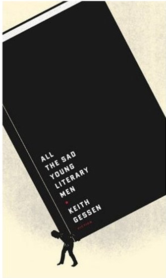
One thing most of these below have in common is beautifully clean design. They all know better than to scream "PLEASE! BUY ME!" with a lot of type, a lot of type styles, and other shows of desperation. They also don't use trendy type styles -- or mix a lot of type styles for no reason at all, as too many books do.
That gorgeous Frey cover is by the amazing Chip Kidd. More of his work here (turn the pages at the bottom). Veronique Vienne's book about Kidd's work is Chip Kidd (Monographics).
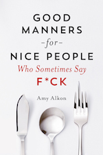
The one that is not clean, the last one, is clever. I don't know what it says on the cover of that book, but I'd make a beeline across the book store to find out. "Clutter" like this works -- it has to have a purpose. It has to make you pick up the book and want to examine it.
And that's what all of these do for me. 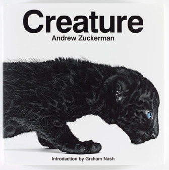


One of the problems with book covers so many publishers put out is that they look like book covers are "supposed" to look -- which means they look like all the other books in the book store. Seth Godin has a wise take on how to create a breakthrough book cover, from his book, Unleashing the Ideavirus (which I recommend):
The prevailing wisdom is to create a cover that's attractive but not offensive. Something that will attract attention from everyone and offend no one.This is nonsense, of course. It can't possibly attract everyone and offend no one. The very best cover images are like a cold glass of water thrown in your face. They break one or more rules of graphic design or industry rules of thumb. They play off existing images but change them in a vital and important way. They're loud. They attract the eye, but they also hold it. And most of all, they intrigue us enough that we need to understand what's inside: we set ourselves up to be exposed to the virus.
Of course, the point isn't to simply be offensive, but to push the envelope in just the right way -- in keeping with what's in the book, and in a way that breaks through the clutter in the book store.


Never read it, but always liked the look of it.
Crid [cridcridatgmail] at March 3, 2009 8:06 AM
I like all of those! I typically find fairly simple covers the most striking (unless we're talking reference books or kids' books, in which case I like lots of detail, texture, etc.) I don't like an overly-decorated cover unless it's really beautiful.
I'm the same way with things like cosmetics: I like the bottles and canisters with plain type on a plain background. (Peter Thomas Roth, Philosophy, Perricone, etc.)
ahw at March 3, 2009 8:48 AM
Amy Alkon
https://www.advicegoddess.com/archives/2009/03/book-covers-i-l.html#comment-1636789">comment from ahwMe,too. I think overselling is a serious mistake. I see it on book covers all over my house. The funny thing is, it's the simpler ones that stand out, even like Stone the Crows: Oxford Dictionary of Modern Slang (Oxford Paperback Reference), which the Oxford people sent me after I wrote them repeated morose e-mails that they have yet to finish the fantastic Random House Dictionary of American Slang.
I have this one: Random House Historical Dictionary of American Slang, Vol. 1: A-G
And this one: Random House Historical Dictionary of American Slang, Vol. 2: H-O
But, Oxford, which took over the project, has yet to finish P-Z. Very depressing. And I always seem to need to look up some word that starts with "S."
Amy Alkon at March 3, 2009 8:59 AM
The Japanese are really in tune with the less is more philosophy of design. It's not book covers, so slightly off topic, but their cell phones are works of art.
They are expensive, but they have things like full motion video cameras and the ability to pay using your phone like a credit card. Even the user interface for text messaging is elegant - you spell words phonetically and chose the characters for the word you want from a list. (Japanese is full of homonyms.) I've never seen a clunky looking phone, unlike here.
Even their paperback books used to come with a small ribbon attached to the binding at the top for use as a bookmark.
I appreciate good design, mainly because it's something I could never be good at.
MarkD at March 3, 2009 9:45 AM
Amy Alkon
https://www.advicegoddess.com/archives/2009/03/book-covers-i-l.html#comment-1636803">comment from MarkDAny design stuff is on topic. Got a link?
Amy Alkon at March 3, 2009 9:48 AM
As publishing - an always tight-margined industry - gets tougher, its harder to justify giving each book a full design treatment.
That's why Penguin and other British publishers instituted house designs. Each book/author gets a visual signature within the set template.
It also boosts sales when there's a "publisher's house brand" endorsing an unknown author.
Less creative, but it works on several levels.
Ben-David at March 3, 2009 12:12 PM
Amy- a bit off topic here, but if you get a chance check out the film Diary of a Tired Black Man. It's a really interesting film about the relationships of many black men and women, and the effects of black women growing up without fathers in the household.
Eric at March 3, 2009 12:26 PM
Amy Alkon
https://www.advicegoddess.com/archives/2009/03/book-covers-i-l.html#comment-1636843">comment from EricThanks, Eric - here's a link to a review:
http://aalbc.com/reviews/diary_of_a_tired_black_man.htm
Amy Alkon at March 3, 2009 1:09 PM
Wait! Wait! It turned incredibly stupid and just plain high school amateur. It would have been interesting had it been edited down to 45 minutes. About the only thing missing was Ted Danson tap dancing in black-face.
Eric at March 3, 2009 1:30 PM
Whoops! Thanks -- I have a film about Picasso to watch, so I think I'll keep that tops on my list!
Amy Alkon at March 3, 2009 6:28 PM
Forgot to mention, a major problem in design is design by committee:
http://whatis.techtarget.com/definition/0,,sid9_gci874014,00.html
Amy Alkon at March 3, 2009 6:30 PM
The Financial Times has a regular feature on great cover design. Every Sat/Sun.
Kate at March 3, 2009 6:38 PM
I am rather fond of this cover, even though the lens through which Erickson views addiction is fundamentally flawed, making the whole thing a pointless wash.
DuWayne at March 3, 2009 8:12 PM
On the other hand, this cover annoys the shit out of me, but it is one hell of a great book.
DuWayne at March 3, 2009 8:13 PM
But then there's this cover, which probably bothers a lot of folks, but I happen to adore. Of course it helps that I absolutely love this book and the most wonderful friends who gave it to me....
DuWayne at March 3, 2009 8:16 PM
My problems with a lot of book covers is that they're slutty and desperate. They're almost telling you the book has nothing to offer, so they mix a bunch of type styles and scream at you. Use of trendy type styles which quickly become outdated -- or are outdated already at the moment they're applied to the cover -- is one example of this desperation. Nothing sadder than a book that, a year or two out, looks like one of those 60-year-old women who's tarted up like a 20-year-old nightclub chippie.
Amy Alkon at March 4, 2009 12:39 PM
My son drew the cover of my horror novel "Just.Another.Common.Killer" and I am quite proud of him for it. I wanted to share but can't upload the picture...
You can view it on my personal webpage (and view details about the book at the same time):
http://www.wix.com/chantalbellehumeur/me
Chantal Bellehumeur at April 26, 2011 1:24 PM
Leave a comment