


Working The Room
Here I am at the annual alt weeklies conference doing the hard sell.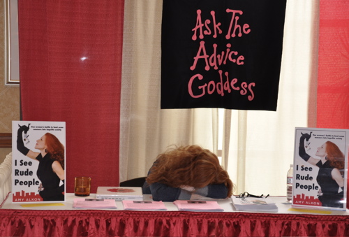 Actually, I write about this in my book, I SEE RUDE PEOPLE: One woman's battle to beat some manners into impolite society, on the collapse of manners and how to change things (Oct. 30, 2009, McGraw-Hill): The way some people are talented at soccer or ballroom dancing I am talented at sleeping. I can just put my head down and nap.
It's not a natural talent -- I learned to do it after taking one yoga class. Hate-hate-hated yoga, especially Santa Monica-style, and never went back, but now I can slow down my breathing and conk myself out.
photo by Clif Garboden


I know it's off topic, but I LOVE your HAIR. Holy cow, what I would do for such thick shiny red locks!
Sarah at June 27, 2009 8:42 AM
last I checked amazon had you release dat as nov 27. I learned how to sleep while standing in the army. Also if I happen to be asleep I always wake up at 0530 central, half an hour befor morning formation on Ft Knox.
What kind of yoga did you do? as little about it as I can recall there are 10 or so distinct versions
lujlp at June 27, 2009 8:44 AM
Amy Alkon
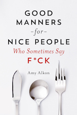
http://www.advicegoddess.com/archives/2009/06/27/working_the_roo.html#comment-1656034">comment from lujlpThanks, Sarah...and luj, it was Oct. 30. November 27 -- ugh -- would be just awful...it would get lost in the Xmas and Thanksgiving rush. I just wrote to my editor in a panic. And that isn't the cover type either, that they have on Amazon, which I find prissy and too chick flick'y. The type you see in the photo I did myself -- it isn't final, either, and I'm not a graphic designer (although I did shoot photostats for Seymour Chwast, Tibor Kalman, and Roger and Pinky Black when I was living in Manhattan in my early 20s, working at The Stat Store, and going to NYU). Waiting to see the next version from the publisher, which they have yet to send. And Gregg shot the photo -- on my porch!
Amy Alkon at June 27, 2009 8:58 AM
Great book cover!!!!!
Feebie at June 27, 2009 9:02 AM
Amy Alkon
http://www.advicegoddess.com/archives/2009/06/27/working_the_roo.html#comment-1656041">comment from FeebieThanks so much!
Question: Is there anybody who doesn't think it's absolutely nuts to publish the book on November 27, the day after Thanksdiving? There are new ideas in this book -- ideas that haven't been published or aired before -- and it's my feeling that because of this, especially, this book needs to be out at the latest, October 30, to give me at least the first two weeks of November to get the message out and understood.
Also, font suggestions would be appreciated. The font I have is Futura Bold Condensed.
Amy Alkon at June 27, 2009 10:04 AM
I LOVE the cover too - you're way more attractive than the original 50 ft. woman! o.O
I like the Comic Sans font myself, but that's just me. Courier is also nice. Monotype Corsiva is out though. Not too many people can read cursive! Maybe Lucida Sans?
And if the book is released on Oct. 30, that would be perfect - I could give out several copies over Thanksgiving dinner to some very needy souls, who absolutely MUST read it before Yule. Although the day AFTER Thanksgiving is supposedly one of the biggest shopping days BEFORE Christmas.
Flynne at June 27, 2009 10:12 AM
Yes, I think it's not nuts. It's the biggest sale day of the year, and bookstores will be packed with people doing early Christmas shopping.
-----
Not that you have the time to see it, but Tucson holds the saddest collection of antiques there ever was: the Davis-Monagham AFB salvage yard, here in Google Earth.
I lost count of the awesome planes I had no chance to ride.
Radwaste at June 27, 2009 10:19 AM
Amy Alkon
http://www.advicegoddess.com/archives/2009/06/27/working_the_roo.html#comment-1656046">comment from FlynneThanks, but those are all too girly.
Amy Alkon at June 27, 2009 10:21 AM
We've seen you cavorting with authors and dancing across France in railcars and eveningwear , but this is the best picture of you.
Implicit Theme #1: You're just trying to give some helpful advice, but some people's lives are so fucked up that there's nothing you can do but weep.
Implicit Theme #2: The travails of the independent businesswoman; running ones own shop in today's challenging media market is a really tiring.
Crid [CommentCrid@gmail.com] at June 27, 2009 10:55 AM
I'll weep if my publisher doesn't change my pub date.
Amy Alkon at June 27, 2009 11:00 AM
What is it with the military and sleeping? Everyone I've ever known who was military could fall asleep on command, instantly. That's a skill it'd be worth going through boot camp for! Maybe I'll try yoga...
momof4 at June 27, 2009 11:21 AM
Notice how even the less-than-1-inch-tall version of the cover in this photo immediately commands attention. I think you have a winner. I like the Futura. You need a bold, blocky font to go along with the bold, blocky city skyline logo along the bottom.
And that is an amazing mop you have on your head!
Martin at June 27, 2009 11:28 AM
Amy Alkon
http://www.advicegoddess.com/archives/2009/06/27/working_the_roo.html#comment-1656056">comment from MartinAw, thanks. I like the Futura, too. Have yet to see anything better. Word has it from my editor that they got approval to go through with something Futura-like...something like my type here.
I like bold, clean designs and subtle humor (how I'm almost about to eat one of the rude people) as opposed to broad humor.
I love Jean Paul Goude, and this shot he took (for a DVD or record cover) of Grace Jones:
http://wherethereisnothing.com/wp-content/uploads/2008/09/grace-jones-by-jean-paul-goude.jpg
Also liked this Tilda Swinton image:
http://tr.im/pZvE
P.S. Don't try to put in two links in a post - my filter will bite you and send you to spam jail. (I'm doing it from within my software.)
Amy Alkon at June 27, 2009 11:35 AM
Ick. It's Davis-Monthan AFB. No doubt dry and hot.
Radwaste at June 27, 2009 11:37 AM
Amy Alkon
http://www.advicegoddess.com/archives/2009/06/27/working_the_roo.html#comment-1656058">comment from momof4Maybe I'll try yoga...
It's particularly odious in Santa Monica. They're yoga fundamentalists.
But, basically, you just slow your breathing down, breathe really slowly in and out, and breath from your diaphragm. If I'm in a noisy place, I'll put on Jackie Gleason's Music, Martinis and Memories or wear Hearos earplugs.
Amy Alkon at June 27, 2009 11:39 AM
A font I like is Franklin Gothic Medium, but Franklin Gothic Heavy might be better for a book cover.
Amanda at June 27, 2009 12:03 PM
Chip Kidd used Franklin Gothic -- but from the New York Daily News covers, not medium, I don't think -- for the covers he did for Elmore Leonard in the 90s (best covers anybody in America's done for Elmore). I considered that, but I feel I need something bolder. It's really tough. People say the Futura isn't right, but I have yet to see anything better.
I called the Daily News, my first paper, and they told me it was FG, and also that they used to use blocks of wood to set the type in the Ford cover days. LOVE this type:
http://www.bluespotblog.com/uploaded_images/ford_dn-712840.jpg
Amy Alkon at June 27, 2009 12:10 PM
What about Tahoma or Verdana, bolded? Then there's always Century Gothic, but I don't think it would look all that good on the cover.
Flynne at June 27, 2009 12:22 PM
Amy Alkon
http://www.advicegoddess.com/archives/2009/06/27/working_the_roo.html#comment-1656065">comment from FlynneThanks - prefer a beefier font than all of those. Considered all the fonts available on Word, and then some. This is tough.
Amy Alkon at June 27, 2009 12:26 PM
I used to be able to get to sleep any time, any where. Now I can't fall asleep easily at all. Any even slightly irregular noises around me will keep me from falling asleep - a window rattle, sometimes even my wife's breathing will do it. As soon as I become aware of the noise, that's it. Use a white noise generator, which helps some, but still. Not being able to get to sleep is incredibly frustrating. Fortunately, there's always work to be done.
I'm with you, Amy, about the publication date. My sense from my work is that people are utterly distracted from early or mid November until the end of January (at least). That's not the time to debut something new; I think it would make promoting things very difficult.
Cheezburg at June 27, 2009 12:49 PM
Amy Alkon
http://www.advicegoddess.com/archives/2009/06/27/working_the_roo.html#comment-1656069">comment from CheezburgThanks, Cheez - I think you're right about the distraction level. I'm so upset about this.
By the way, I have tiny ear holes, and those Hearos Xtreme earplugs I linked to above are super. They have an annoying air conditioning system at this hotel -- quite loud -- and I used them to mask it out.
Amy Alkon at June 27, 2009 12:52 PM
If you prefer Futura (which I like), you should stay in the geometric sans-serif family. There's Gotham (and Gotham Bold), which is the font used for GQ magazine. There's also ITC Avant Garde and Avenir. Or you can go for the most basic of all the sans-serifs, Helvetica Bold Condensed. A tad boring, but very blocky. I imagine that the typesetting/printing equipment used to set the book may influence the ultimate font choice -- not all systems support the same fonts.
As for the book's release date, October 30 is probably better, particularly as it gives you some time to do publicity, and get word-of-mouth going, before the big Thanksgiving shopping weekend. But I don't think November 30 is terrible, especially if you can get some pre-publication interviews lined up and encourage people to buy it in advance on Amazon.
Ms. Gandhi at June 27, 2009 1:18 PM
Amy Alkon
http://www.advicegoddess.com/archives/2009/06/27/working_the_roo.html#comment-1656077">comment from Ms. GandhiLike Gotham Narrow Ultra, the bold condensed version - thanks - good ideas.
Amy Alkon at June 27, 2009 2:18 PM
Amy, my better half and I were just in Tucson a week ago. If you like Mexican food at all, get thee to Guadalajara Grill. They make your salsa fresh at the table to your specifications, and the Chile Verde is great. Also, El Charro is famous and quite delicious. I brought back some red sauce for my sister, who's claims it's the best she's ever had.
MIkeD at June 27, 2009 2:37 PM
Amy Alkon
http://www.advicegoddess.com/archives/2009/06/27/working_the_roo.html#comment-1656082">comment from MIkeDHey, thanks. They're taking us somewhere tonight, but that sound good.
Amy Alkon at June 27, 2009 4:13 PM
Thanks for the heads up. I've tried earplugs, and they didn't cut out enough sound, but they help. I'll consider those next time I get some (and buy via your ref link if decide to get them).
Cheezburg at June 27, 2009 5:06 PM
Amy Alkon
http://www.advicegoddess.com/archives/2009/06/27/working_the_roo.html#comment-1656092">comment from CheezburgI recommend in-ear noise-canceling headphones. I use them with Jackie Gleason, but white noise might work, too, if it's loud enough.
Amy Alkon at June 27, 2009 6:21 PM
That picture cracks my shit up
Crid [CommentCrid@gmail.com] at June 27, 2009 6:56 PM
So who took the photo?
JustMe at June 27, 2009 7:15 PM
I just hated those people(eg. islamic people) who had been unreasonably rude to me without any valid reason, other than trying to imply that they were in some ways "more superior" than me.
I don't mind rude people (who are of good honest character) who may tried to "correct" me in a rude manner.
But I do draw a line with extremely dogmatic rude people(who are just too lazy to do the right thing) and who are just out to be extremely unreasonably nasty.
WLIL at June 27, 2009 9:13 PM
Whoops. Time to change the Wikipedia entry, where I wrote that your book title is "Revengerella."
Patrick at June 27, 2009 9:33 PM
Font should be easy to read, most importantly. I would not go for anything fancy. Should be plain with nothing to distract from the message. My personal favorite is Georgia, because it uses the "g" found on old typewriters.
If I were writing a book that I wanted people to actually finish, I would go with Arial.
Patrick at June 27, 2009 9:45 PM
Amy Alkon
http://www.advicegoddess.com/archives/2009/06/27/working_the_roo.html#comment-1656111">comment from JustMeSo who took the photo?
Boyfriend, on my porch!
Amy Alkon at June 27, 2009 10:04 PM
What is it with the military and sleeping? Everyone I've ever known who was military could fall asleep on command, instantly.
It comes from always having too much to do and too little to do. And after you do some things enough, you do them by rote and turn your mind off.
Jim P. at June 28, 2009 5:39 AM
"If I were writing a book that I wanted people to actually finish, I would go with Arial."
And the world's publishers eschew that in favor of serif fonts, like Bookman, Times New Roman and so forth, because they are easier to read.
At work, we decided to use Arial in procedures for just one reason: you could get more characters on one page. This sacrificed clarity and ease of composition and editing because of narrow kerning; those who selected it - actually, they picked Helvetica, but that's a long story - didn't know what they were doing. We are a desktop publishing venture, having regulatory-grade procedures to write, but clueless people thought we were using typewriters. If you must use a sans-serif font - as we do for fax clarity - something wider, like Tahoma or Verdana will be better.
Page design means a lot when you are writing for an audience. The Mac is not a typewriter, and neither is the PC (there's a version for them, too), and there is a lot going on behind the scenes at your favorite magazine to make sure you concetrate on their story.
Radwaste at June 28, 2009 9:47 AM
I always use Veranda myself
lujlp at June 28, 2009 9:59 AM
Amy Alkon
http://www.advicegoddess.com/archives/2009/06/27/working_the_roo.html#comment-1656148">comment from RadwastePlease understand that I am NOT talking about the type inside the book -- I gave my editor the example of my friend Barb Oakley's book Evil Genes as one I found to have a readable interior.
I'm talking about the type for "I See Rude People" and "One woman's battle...etc."
Again, I am not a designer but I love type and I'm appalled by the terrible type and bad design I see on many book covers.
Seth Godin, author of Purple Cow: Transform Your Business by Being Remarkable, gives wise advice on book covers - don't have the quote here with me (I'm in the Tucson airport) - but it's that they shouldn't look like book covers, ie, like everything else in the book store. I tried to do that with mine, and have really, really pushed to have it be something I can feel proud of. I would've put the type "I See Rude People" at the top, the way.
Amy Alkon at June 28, 2009 10:08 AM
Oct. 30 is perfect. Just in time for the rude little beggars who come knocking with sugarlust in their eyes.
John Inderdohnen at June 28, 2009 10:19 AM
Your cover looks great, Amy! Congrats to Gregg's photo-taking skills.
About your font question: Have you considered Frutiger? Not too far away from Futura Bk, but I like the Frutiger's wider letter-spacing a bit better. (I have used both fonts before, but for different purposes.)
Check it out here:
http://en.wikipedia.org/wiki/Frutiger
Rainer at June 28, 2009 1:05 PM
Huh-- I've never given thought to ear hole morphological variation before! Neat.
I LOVE this cover, btw!!!
Melissa G at June 28, 2009 1:31 PM
Umm, don't forget that most page-design programs and MS Word allow you to adjust the kerning and leading of any font you use. This allows you to stretch a font which has the character shapes you like to the spacing you like, horizontally and vertically.
MS Office's Publisher will install over 200 fonts for you. If you can't pick a winner out of those, plus the ones your system came with, ITC Fonts and others can show you something you like.
Or, get out the crayon.
Radwaste at June 28, 2009 2:16 PM
Amy - seriously, talk to James Lileks. He's a bit of a font snob, and he could probably nail it for you.
Besides, he's funny as hell, and polite too.
brian at June 28, 2009 5:53 PM
Amy Alkon
http://www.advicegoddess.com/archives/2009/06/27/working_the_roo.html#comment-1656204">comment from brianGood idea about Lileks. Also have to talk to my book editor about this pub date thing. Had a nightmare about it last night. I got trampled by people on Black whateverit'scalled while holding up a copy of my book and trying to tell people about it.
Amy Alkon at June 28, 2009 6:12 PM
Speaking of telling people about your book, I don't know if you're going to be promoting "I See Rude People" in Canada. If you are, you might want to check out http://www.mcnallyrobinson.com/about
They have stores in Winnipeg, Saskatoon, a brand-new one in Toronto, and, on your side of the fence, one in Manhattan. All locations have chock-full events calendars, & they do a good job of publicizing authors of all sorts.
Martin at June 28, 2009 10:32 PM
Amy Alkon
http://www.advicegoddess.com/archives/2009/06/27/working_the_roo.html#comment-1656222">comment from MartinThanks, Martin. The book will be published in Canada, and in English-speaking countries around the world, which is pretty cool.
Amy Alkon at June 28, 2009 11:03 PM
On my first glance at that photograph, I thought, "Why did she leave a red wig laying on the table?" ;)
Cousin Dave at June 29, 2009 12:34 PM
Amy Alkon
http://www.advicegoddess.com/archives/2009/06/27/working_the_roo.html#comment-1656333">comment from Cousin DaveHeh heh...funny. You Tarzan, me Bozo.
Amy Alkon at June 29, 2009 12:39 PM
Take a look at Bodoni MT Black. It has a certain art deco quality, but it's also heavy and fairly masculine. If you're looking only at boxy fonts this won't do, but you do seem to have a preference for the deco sensibility. The skyscape in the background has the same feel.
Laurie at July 1, 2009 2:29 PM
Amy Alkon
http://www.advicegoddess.com/archives/2009/06/27/working_the_roo.html#comment-1656712">comment from LaurieThanks- but looking for a sans serif or maybe a handwriting font that's really bold yet goes with the sort of classy but strong image. It would have to be bold as well.
Apparently, the publisher is going to go with my Futura Condensed Bold pictured here -- unless I come up with something new. I'm a little worried about that because I'm not a designer, just a girl who shot stats for some bigwigs (Seymour Chwast, Tibor Kalman, Roger and Pinky Black) when I was in my early 20s and work at The Stat Store on Fifth Ave. and 19th Street. I developed a love of type then, and asked them, when they'd pick up their stats, about what they were doing. Not quite the same as being trained in type and design. The Folio Weekly designer is sending me something, and the Athens News designer sent me a really cool type design, but the type went over my boobs...that won't work!
Amy Alkon at July 1, 2009 2:52 PM
Leave a comment